This is a collection of bugs/enhancements and so on that should be done in order to get the iRATE client to a nice, stable point for a 0.4 release.
The status bar is prone to flicking between several things when downloads are going, which chews CPU, and doesn't look all that nice. This has been improved somewhat by forcing a delay, but it still isn't perfect.
Robin's suggestion: Have two two classes of message: priority and non-priority. Non-priority messages cycles through one every second or three, priority messages override the cycling so that things like tooltips are always displayed. Things can add messages with these priorities when the event starts, update the string that contains the message as (say) downloading progresses if it makes sense to, and remove the message from the list when they are done, or when the menu item loses focus or whatever. There may also be a default message, which is only shown when there is nothing left to see. This can be the '11 Unrated Tracks' message, or similar.
(Stephen Blackheath: Most of this code already exists - Messages already have priorities. Currently the highest priority message is always shown.)
GtkCombo? no longer works starting with GTK 2.4, and the GtkComboBox? setup is quite different.
Some indication of time played or left to play for the current track would be nice.
Additional menu options for the 'Action' menu could also be added to allow rating the current track. The 'sort by' menu option should have some kind of 'ascending/descending' toggle nearby.
Explicit keyboard shortcuts displayed on the menu would be nice.
The popup track info dialog box should include the URL of the track. This information is not currently available anywhere else in the user interface, only in the trackdatabase.xlm file.
As the iRATE user interface has gone through several experimental changes it has gotten a lot cleaner and more solid. First there were track-rating buttons with text on them, then the buttons were removed and the rating function was moved to the context menu. While the removal of the rating buttons de-cluttered the interface significantly, it made it hard to rate tracks, as using a context-menu was not easily discoverable. Now the buttons are back in the form of a four-star icon, and users can click on the stars to rate the currently playing track. This looks cleaner than the text-buttons, and is simpler and more easily discoverable than the context-menu method. The following paragraphs mostly relate to the previous version of the user interface, without buttons...
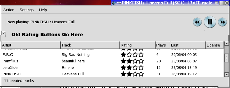
One proposal is to have the rating buttons hidden normally, but have a button that can open the rating panel up. This automatically opens when the selection is automatically moved to an unrated track, and automatically closes when the selection is automatically moved to a rated track. Opened, the interface will look something like this. When closed, it will look like it does now, but with a right-pointing button where the down-pointing button is in the mockup. Users may be confused about the buttons applying to the playing track, rather than the selected track. These rating buttons will work on the selected track, not the currently playing one.
(Stephen Blackheath: I agree, but I think the rating buttons should be to the right of the track name, to save screen space and strength the idea of the arrow connecting the buttons with the currently playing track, like this.)
(Robin: I don't think that it needs to be associated, I think that it should work with the selected track, rather than the playing one. This means that you can rate other tracks, get info on them, etc without having to interrupt what you're playing. It also makes it more consistent with the way that other programs tend to work)
In conjunction with this, I propose a new selection behaviour. When a playing-track change happens, the selection bar will move to this unless it has been manually moved within the past n seconds (something like 10 perhaps). We should add a small button somewhere (perhaps on the right, opposite the show/hide button) that takes the selection to the currently playing track.
(Stephen Blackheath: I agree except I strongly disagree with the addition of the button. I propose clicking on the track name at the top should select it in the list.)
(Robin: But clicking the trackname is non-discoverable, you wouldn't normally try that. Having a small button, perhaps with a bullseye icon or something, is better because it is then clear that this functionality exists.)
(noname): Clicking text is discoverable when the text is underlined on mouseOver, every web page uses it and hyperlink from {{ http://www.novocode.com/swt/ }} shows how to do this in SWT. Of course, most users would not use that, but access it simply by using shortcut-L, (which is/should be in the Track menu under Show current Track).
Robin: Underlined, yes, but not on mouseover. Then you would only discover it by accident. But having the words blue and underlined would indicate a link. However, I think it would be better to have some kind of button as that is consistent with the rest of the (generally button driven) UI.
(noname): Well, at least we agree on the fact that it is an awkward UI to click on a trackname in the header to select it in the list. We however seem to disagree about the buttons, which look more like sore thumbs in the user interface to me. Notice how the size of the stars do not match the capital height and the gray level of the text in the list, for instance.
(Gobelet): Why not use stars clickable on the bar, like in Apple's iTunes?
(michael_redux): I think the new version of the user interface with the clickable four-star icon answers most of the suggestions above. There is no point it hiding it because it displays useful information, and it is compact enough that it allows for separately rating both the currently playing track as well as tracks in the playlist. (Although how someone can rate one track while listening to another is a mystery to me, so I think the default behavior for rating a track based on a keyboard shortcut should be to rate the currently playing track, not the highlighted track in the playlist.)
If people want "information" about the selected tracks in the playlist, maybe there could be a small "i" button for each track in the playlist, next to the four-star icon, similar to the one next to the rating-icon for the currently playing track.